Key Points
- Principal component analysis (PCA) is a method for dimensionality reduction and data visualization that transforms a set of correlated variables into a new set of uncorrelated variables called principal components.
- The principal components are linear combinations of the original variables that explain the maximum amount of variance in the data. The first principal component (PC1) explains the most variance, the second principal component (PC2) explains the next most variance, and so on.
- To perform PCA in R, we can use the prcomp function, which takes a data frame or a matrix as input and returns an object of class prcomp that contains the results of the PCA.
- To visualize and interpret the results of PCA in R, we can use the plot and biplot functions to plot the principal component scores and loadings or other functions such as fviz_pca from the factoextra package to produce more advanced plots with colors, labels, ellipses, etc.
- PCA can help to simplify the data, remove noise, and reveal hidden patterns or structures. PCA can also be used for data visualization by plotting the data points on the first two or three principal components, which can reveal clusters or outliers.

- Do you have a data set with many variables and want to find the most important ones?
- Do you want to reduce the complexity of your data and reveal the hidden patterns or structures?
- Do you want to visualize your data in a lower-dimensional space and identify clusters or outliers?
If you answered yes to these questions, consider using principal component analysis (PCA) in R.
My name is Zubair Goraya, and I am passionate about data analysis and R programming. I have been using R for more than five years and have developed many tutorials related to RStudio and data analysis. During my PhD research, I encountered several challenges in performing PCA analysis, so I investigated and found solutions.
In this tutorial, I will share what I have learned about PCA and how to apply it in R using the prcomp function. I will also show you how to visualize and interpret the results of PCA using various functions and techniques.
What is Principal Component Analysis (PCA)?
Principal component analysis (PCA) is a popular and powerful method for dimensionality reduction and data visualization. It can help you to find the most important features or patterns in your data set and to project them onto a lower-dimensional space. In this tutorial, I will show you how to perform PCA in R using the prcomp function and how to interpret and visualize the results.
Keep reading to learn how to perform PCA in R. You will learn how it works, how to perform it in R using the prcomp function, and how to visualize and interpret the results. You will also learn some tips and tricks on using PCA effectively for your data analysis. By the end of this tutorial, you will be able to perform PCA in R like a pro.
Principal Component Analysis in R?
PCA can be a useful tool for data analysis in R, as it can help to simplify the data, remove noise, and reveal hidden patterns or structures. However, It also has some limitations and assumptions that must be considered before applying it to your data.
Here are some tips and tricks on how to use it effectively:
- Check the assumptions
- Choose the appropriate scaling and centering options
- Determine the number of principal components
- Interpret and visualize the results of Principal Component Analysis.
Check the assumptions
PCA assumes the data is numeric, continuous, linearly related, and normally distributed. Suppose your data does not meet these assumptions. In that case, you may need to transform or standardize your data before performing it, or use a different method, such as nonlinear PCA or factor analysis.
data(USArrests)
str(USArrests) #is numeric and continuous
cor(USArrests) # is linearly related
apply(USArrests, 2, shapiro.test) #is normally distributed- If some variables are not numeric or continuous, you can exclude or convert them using the appropriate methods.
- If some variables are not linearly related, you can exclude or transform them using appropriate methods.
|
Murder |
Assault |
UrbanPop |
Rape |
|
|
Murder |
1.00 |
0.80 |
0.07 |
0.56 |
|
Assault |
0.80 |
1.00 |
0.26 |
0.67 |
|
UrbanPop |
0.07 |
0.26 |
1.00 |
0.41 |
|
Rape |
0.56 |
0.67 |
0.41 |
1.00 |
- Perform the Shapiro-Wilk normality test for each variable, and If some variables are not normally distributed, you can either exclude them or transform them using appropriate methods. So, we can exclude the urban population variable from our data set
|
Test |
Variable |
W |
p-value |
Results are
Significant |
|
Shapiro-Wilk |
Murder |
0.957 |
0.067 |
Yes |
|
Shapiro-Wilk |
Assault |
0.952 |
0.041 |
Yes |
|
Shapiro-Wilk |
UrbanPop |
0.977 |
0.439 |
No |
|
Shapiro-Wilk |
Rape |
0.947 |
0.025 |
Yes |
Choose the appropriate scaling and centering options.
Scaling and centering the variables before performing PCA can help to make the variables comparable and avoid dominance by large-scale variables. However, scaling and centering can also change the interpretation of the principal components and the loadings. For example, if you scale the variables, the loadings will represent the correlations between the variables and the principal components, while if you do not scale the variables, the loadings will represent the covariances. Choosing the scaling and centering options that suit your data and research question would be best.
data<-scale(USArrests[,-3]) # Scale our datasetDetermine the number of principal components to retain
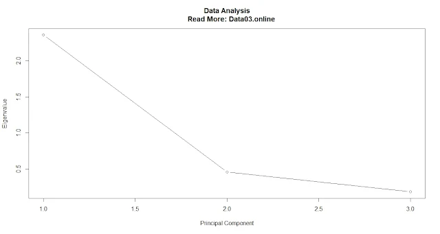
You should choose some components that capture most of the variance in the data without overfitting or underfitting. We must perform a PCA analysis before determining the number of components to retain.
pca <- prcomp(data, scale = TRUE)
summary(pca)
Importance of components
|
PC1 |
PC2 |
PC3 |
|
|
Standard deviation |
1.536 |
0.677 |
0.428 |
|
Proportion of
Variance |
0.786 |
0.153 |
0.061 |
|
Cumulative
Proportion |
0.786 |
0.939 |
1.000 |
Scree plot
plot(pca$sdev^2, type = "b", xlab = "Principal Component", ylab = "Eigenvalue") #Plot a scree plot of the eigenvaluesThe proportion of variance explained.
Calculate the proportion of variance explained by each principal component
pve <- pca$sdev^2 / sum(pca$sdev^2)
Plot the proportion of variance explained by each principal component
plot(pve, type = "b", xlab = "Principal Component", ylab = "Proportion of Variance Explained")
A common threshold is to retain only those principal components that explain at least 5% or 10% of the total variance.
Cumulative proportion of variance explained.
Calculate the cumulative proportion of variance explained by each principal component.
cum_pve <- cumsum(pve)
Plot the cumulative proportion of variance explained by each principal component(
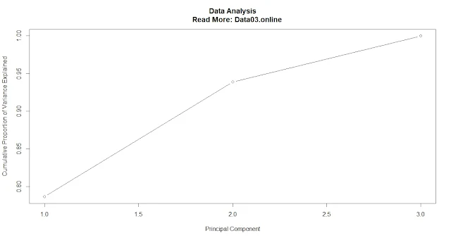
plot(cum_pve, type = "b", xlab = "Principal Component", ylab = "Cumulative Proportion of Variance Explained")
A common threshold is to retain only those principal components that explain at least 80% or 90% of the total variance.
Interpret and visualize the results of Principal Component Analysis.
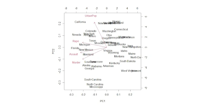
To interpret and visualize the results, you can use the plot and biplot functions on the pca object, which produce a scatter plot of PC1 versus PC2 with or without arrows representing the original variables.
You can also use functions such as fviz_pca from the factoextra package, which can produce more advanced plots with colors, labels, ellipses, etc. It would be best to look for clusters or outliers in the data points and correlations or patterns among the variables.
Further analysis or Visualization of PCA
Once you have performed PCA on your data, you can use the principal component scores or loadings for further analysis or visualization. For example, you can use the principal component scores as input for clustering and classification algorithms or as features for machine learning models. You can also use the principal component loadings to create new variables or indices based on the original variables.
Example: PCA on USArrests Data Set
We will use an example data set called USArrests, which contains statistics on violent crime rates (per 100,000 population) in each of the 50 US states in 1973. The data set also contains the percentage of the population living in urban areas (UrbanPop) and the per capita income in US dollars (Income). We will perform PCA on this data set using the prcomp function and visualize and interpret the results.
# Load the USArrests data set data(USArrests) plot(pca$sdev^2, type = "b", xlab = "Principal Component", ylab = "Eigenvalue") #Plot a scree plot of the eigenvalues # Perform PCA on the numeric variables pca <- prcomp(USArrests, scale = TRUE) # Print the summary of the pca object summary(pca))
The output of the summary function shows the standard deviation, proportion of variance, and cumulative proportion of variance explained by each principal component:
|
Importance of
components |
PC1 |
PC2 |
PC3 |
|
Standard deviation |
1.536 |
0.677 |
0.428 |
|
Proportion of
Variance |
0.786 |
0.153 |
0.061 |
|
Cumulative
Proportion |
0.786 |
0.939 |
1.000 |
Plot the principal component scores
plot(pca)
Plot the principal component loadings
biplot(pca)
Advanced plots with Factor extra
We can also use other functions to create more advanced plots with colors, labels, ellipses, etc. For example, we can use the fviz_pca function from the factoextra package, which can produce plots like this:
Install and load the factoextra package
install.packages("factoextra")
library(factoextra)
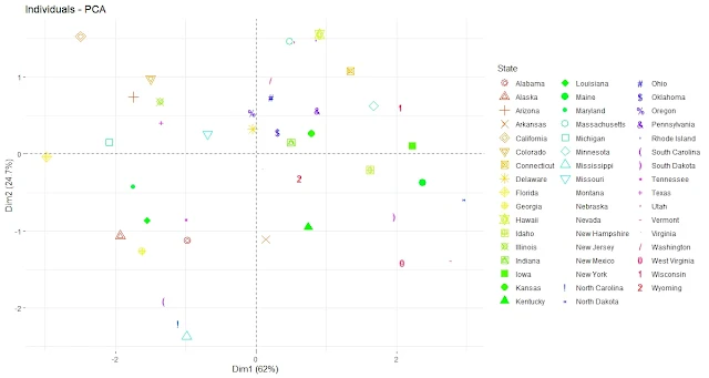
Plot the principal component scores with colors by state
fviz_pca_ind(pca, geom.ind = "point", pointsize = 2,
             col.ind = as.factor(rownames(USArrests)), # color by state
             palette = rainbow(50), # use rainbow color palette
             legend.title = "State")
Plot the Principal Component Scores with labels by State.
fviz_pca_ind(pca, geom.ind = "text", pointsize = 2,
             col.ind = as.factor(rownames(USArrests)),
             palette = rainbow(50), repel = TRUE)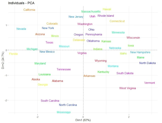
Plot the Principal Component Scores with ellipses by Region
fviz_pca_ind(pca, geom.ind = "point", pointsize = 2,
             habillage = as.factor(state.region), # color by region
             addEllipses = TRUE, # add confidence ellipses
             legend.title = "Region")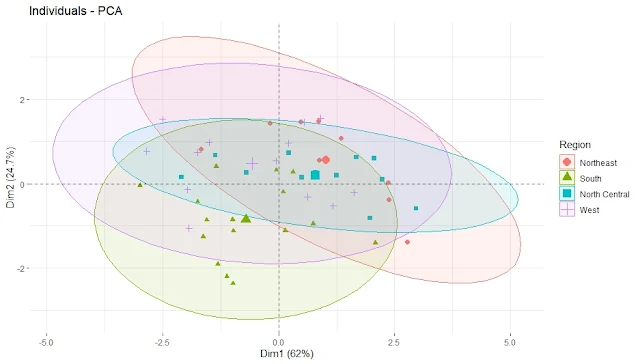
Plot the Principal Component Scores with ellipses by Region and labels by State.
fviz_pca_ind(pca, geom.ind = "text", pointsize = 2,
             habillage = as.factor(state.region), # color by region
             addEllipses = TRUE, # add confidence ellipses
             col.ind = as.factor(rownames(USArrests)),
             legend.title = "Region",
             repel = TRUE)
We can see some regional patterns in the data points, such as Southern states having higher values on PC1 (violent crime rate) and Western states having higher values on PC2 (urbanization and income level). We can also see that some states differ significantly from their regions, such as Florida and Nevada.
Conclusion
In this tutorial, we have learned how to perform principal component analysis in R using the prcomp function and how to visualize and interpret the results using various functions. We have applied PCA to the USArrests data set and found that we can reduce the dimensionality of the data from four variables to two principal components without losing much information. We have also seen how PCA can reveal outliers and patterns in the data.
FAQ
What are some applications of PCA in real-world data analysis?
PCA can be applied to many types of data analysis problems, such as:
- Image compression: It can be used to reduce the number of pixels or colors in an image while preserving most of the information and quality of the original image.
- Face recognition: It can extract the most important features or patterns from a set of face images and use them to identify or classify different faces.
- Gene expression analysis: It can reduce the dimensionality of a large matrix of gene expression values and find the most significant genes or pathways that differentiate different samples or conditions.
- Customer segmentation: It can be used to reduce the number of variables that describe customer behavior or preferences and find the most relevant factors or segments that characterize different customer groups.
How do we perform PCA on categorical variables?
It is designed for numeric and continuous variables and cannot handle categorical variables directly. However, there are some ways to perform PCA on categorical variables, such as:
- Converting categorical variables into numeric variables using dummy coding or one-hot encoding. This creates a new variable for each category, with a value of 1 if the original variable belongs to that category and 0 otherwise. However, this can increase the dimensionality of the data and create sparsity issues.
- Performing multiple correspondence analysis (MCA) instead of PCA. MCA is a method similar to PCA but designed for categorical variables. It transforms a contingency table of frequencies into a set of principal components that capture the associations among the categories. MCA can be performed in R using the MCA function from the FactoMineR package.
What is the best PCA package in R?
Such a question has no definitive answer, as different packages may have different features, advantages, and disadvantages. However, some of the most popular and widely used packages for PCA in R are:
- FactoMineR: Provides a comprehensive framework for multivariate analysis, including PCA, correspondence analysis, multiple correspondence analysis, and more. It also has functions for graphical displays and clustering of the results.
- prcomp: A built-in function in the stats package performs PCA using singular value decomposition (SVD). It is preferred over the princomp function, which uses eigenvalue decomposition because it has slightly better numerical accuracy.
- pcaMethods: The package implements seven different methods for PCA, including SVD, probabilistic PCA, non-linear iterative partial least squares (NIPALS), and more. It also provides functions for cross-validation, missing value imputation, and biplots.
What is the difference between Prcomp and princomp?
Both prcomp and princomp are functions that perform PCA in R, but they use different methods to do so.
- Princomp uses the spectral decomposition approach, which computes the eigenvectors and eigenvalues of the covariance or correlation matrix of the data.
- Prcomp uses the singular value decomposition (SVD) approach, which directly computes the data matrix's singular vectors and values. According to the R help, SVD has slightly better numerical accuracy than spectral decomposition. Therefore, prcomp is preferred over princomp.
What is the difference between PRCOMP and SVD?
PRCOMP is a function that performs PCA using SVD as a method. SVD is a general matrix factorization technique that decomposes any matrix into three matrices: U, D, and V. The columns of U are called the left singular vectors, the diagonal elements of D are called the singular values, and the columns of V are called the right singular vectors. In PCA, the right singular vectors correspond to the principal components, and the singular values correspond to the standard deviations of the principal components.
What is the PCA tool in R?
PCA stands for Principal Component Analysis, a technique for reducing the dimensionality of a dataset by finding linear combinations of the original variables that capture most of the variation in the data. Several tools or functions in R can perform PCA, such as prcomp, princomp, FactoMineR::PCA, pcaMethods::pca, and others. Each tool may have different PCA options, parameters, outputs, and visualizations.
How do I choose the best PCA components?
There is no universal rule for choosing the optimal number of principal components in PCA. It depends on the purpose and the context of the analysis. However, some standard methods or criteria are: Scree plot, Cumulative proportion of variance, Cross-validation.
What are pca1 and pca2?
Pca1 and pca2 are names often used to refer to PCA's first and second principal components. They are linear combinations of the original variables that explain most of the variance in the data. They can create a two-dimensional plot of the data points projected onto these components.
What is princomp?
Princomp is a function in R that performs PCA using spectral decomposition. It returns an object of class "princomp" that contains information such as standard deviations, loadings (eigenvectors), centering and scaling factors, scores (coordinates), and call (matched call).
What is the output of Prcomp?
What is the difference between PCA in R and Python?
What are the common errors people face while conducting PCA analysis in R?
Some of the common errors people face while conducting PCA analysis in R are:
- Not scaling or centering the data before performing PCA. This can lead to biased results if the variables have different units or ranges.
- Not checking for missing values or outliers in the data. This can affect the calculation of the covariance or correlation matrix and the eigenvalues and eigenvectors.
- Not interpreting the results correctly or meaningfully. This can include misreading the scree plot, overfitting or underfitting the data, ignoring the sign or direction of the loadings, or not considering the context or domain knowledge of the data.
