Key Points
- Labels Matter! Axis labels are like signposts on your graph – they tell the reader what they're looking at. Without them, it's just pretty colours and confusion.
- The Trouble with Defaults: ggplot2 is awesome, but sometimes those labels automatically overlap. This is especially annoying with long labels on the x-axis.
- Rotation to the Rescue! You can rotate your labels to keep them neat. The magic happens with the theme() function and its helper, axis.text.x.
- Tweak It: Play with these settings to style your labels perfectly:
- angle: Tilt those labels! (90 degrees makes them vertical)
- vjust: Nudges your labels up or down along the axis.
- hjust: Aligns your labels left or right.
- Going Pro:
- Rotate y-axis labels the same way using axis.text.y.
- Get more control with the 'ggstance' package if you have tricky labels.
Table of Contents
Look, we've all been there. You spend a lot of time crafting the perfect ggplot – killer dataset, colours on point – and then BAM! The x-axis labels smash together like they're having a party no one invited them to. What's the point of beautiful data visualization if you can't read the basics? But hey, chill out. Let's sort this label mess out and get your plots looking sharp.
Related Posts
Understanding ggplot2 Labels
In the ggplot2 graphs, labels play a super important role. They're the guides on your visualization journey. Specifically, axis labels sit along your x-axis and y-axis, giving context to your awesome plots. Without them, your data might be beautiful, but it'd also be a bit of a mystery!
What are axis labels, and why do they matter?
Okay, let's cut to the chase. Axis labels in ggplot2 are those little bits of text along the x and y-axis that tell you what you're plotting. Think of rotating and spacing axis labels as signposts for your data.
Without clear labels, even the informative graph is just a confusing mess. Good labels make your plots understandable for you and for anyone you share them with.
Default label behaviour (overlapping issues)
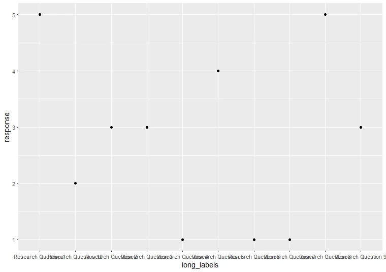
Here's the thing: ggplot2 tries its best, but sometimes, those default axis labels get slightly too friendly. Especially with longer labels or loads of categories, you end up with overlapping text that's harder to read than a squished grocery list. This is where knowing how to rotate those labels comes to the rescue!
Let's generate a data set and Visualization.
library(ggplot2)
set.seed(123)  # For reproducibility
long_labels <- paste0("Research Question ", 1:10)
response <- sample(1:5, 10, replace = TRUE)
df <- data.frame(long_labels, response)
ggplot(df, aes(x = long_labels, y = response)) +
  geom_point()

The "How" of Rotation
Alright, enough about messy labels – let's fix this! ggplot2 gives you some pretty awesome tools to spin those labels like a DJ scratches records (well, almost). The secret weapons are the theme() function and its trusty sidekick, axis.text.x.
The theme() function and axis.text.x control
Step-by-step code example
ggplot(df, aes(x = long_labels, y = response)) +
  geom_point() +
theme(axis.text.x = element_text(angle = 90, vjust = 0.5, hjust=1)) Let's break down what's happening
- angle = 90: Rotates labels a full 90 degrees, making them vertical.
- vjust = 0.5: Vertically centres the labels along the axis.
- hjust = 1: Align labels to the right, keeping them neat.
Understand angle, hjust, and vjust with visuals
Think of angle, vjust, and hjust as your label styling superheroes:
- angle: Controls the tilt (try different values like 45 for a diagonal slant).
- vjust: Adjusts vertical positioning (higher values move labels upwards).
- hjust: Handles horizontal alignment (1 for right, 0 for left).
Important: Depending on your label lengths, you might need to tinker with vjust and hjust. Make sure the labels don't run away from your plot!
Real-World Examples
Long Category Labels (rotate to fit)
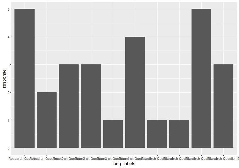
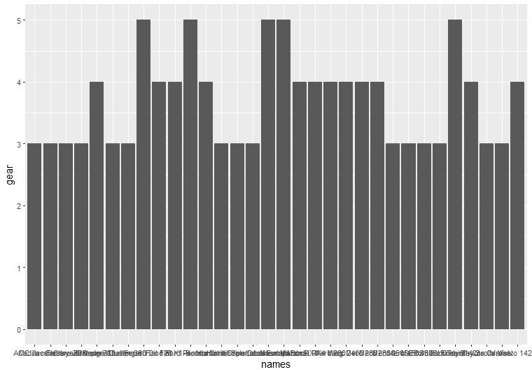
Imagine you're plotting car names as your x-axis labels. Some of those names are bound to be wordy. Here's where rotation becomes your best friend!
ggplot(mtcars, aes(x = names, y = gear)) +
  geom_col()
ggplot(mtcars, aes(x = names, y = gear)) +
  geom_col()  +
  theme(axis.text.x = element_text(angle = 90, hjust = 1))
Crowded Time-Series Plots (improve readability)
Time-series data, like daily sales or stock prices, can make for super dense x-axis labels. Straight labels become a blurry mess. Rotation can untangle that!
Example Code (we'll generate some time-series data)
dates <- seq(as.Date("2023-01-01"), by = "day", length.out = 30)
values <- rnorm(30, mean = 100, sd = 15)
df <- data.frame(dates, values)
ggplot(df, aes(x = dates, y = values)) +
  geom_line() +
theme(axis.text.x = element_text(angle = 90, vjust = 0.5, hjust=1)) 
See how much clearer the dates become? Rotation for the win!
Beyond the Basics: Advanced Rotation Techniques
Alright, you've learned the basics of rotating x-axis labels. But guess what? The fun doesn't stop there! Let's crank up the customization and tackle some trickier scenarios.
Rotating Y-Axis Labels
You might be thinking, "What about the y-axis?" Fear not, my friend! The same principles apply. Instead of axis.text.x, you'll target axis.text.y within your theme() function.
When it's useful
Rotating y-axis labels shines in a couple of situations:
- Super Long Labels: Like with the x-axis, lengthy y-axis labels benefit from a bit of tilt.
- Hierarchical Plots: If you have plots with nested categories, rotating those y-axis labels can improve readability.
ggplot(df, aes(x = dates, y = values)) +
  geom_col() +
  theme(axis.text.y = element_text(angle = 90, hjust = 0.5))

Tips and Customizations
- When not to rotate: Short labels are usually fine as-is. And sometimes, the rotated text might not match the vibe of your plot. It's about making it work for your visualization!
- Adjusting label spacing: If your rotated labels feel too close to the axis, tweak the axis ticks spacing to adjust. margin settings within the theme() function.
- Advanced packages: For seriously complex rotation needs, the 'ggstance' package offers even more flexibility.
Important Note: ggplot2 is awesome, but it's not magic. Sometimes, severely overlapping labels might need a bigger solution – like restructuring your data or choosing a different plot type altogether.
Conclusion
So, there you have it! You've learned the basics of label rotation, ventured into advanced techniques, and discovered situations where tilting those labels can transform your plots from cluttered to crystal clear. Remember, readable labels are the key to ensuring your data visualizations look awesome and communicate your insights. And the best part? With a little ggplot2 know-how, you're always a few lines of code away from perfectly positioned labels. So, next time you see those overlapping x-axis labels, don't groan – rotate them confidently!
Frequently asked questions
How to rotate x labels in ggplot2?
ggplot(your_data, aes(x = x_variable, y = y_variable)) +
  geom_point() +  # Or another geometry type
theme(axis.text.x = element_text(angle = 90, hjust = 1, vjust = 0.5)) - angle = 90 rotates labels 90 degrees (vertical).
- hjust = 1 aligns labels to the right.
- vjust = 0.5 centers labels vertically along the axis.
How do you flip the X axis in ggplot?
Option 1: Rotate labels 180 degrees
ggplot(your_data, aes(x = x_variable, y = y_variable)) +
  geom_point() +
theme(axis.text.x = element_text(angle = 180)) ggplot(your_data, aes(x = x_variable, y = y_variable)) +
geom_point() +
scale_x_reverse() How do you change the angle of the X-axis label in ggplot?
ggplot(your_data, aes(x = x_variable, y = y_variable)) +
geom_point() +
theme(axis.text.x = element_text(angle = 45)) # Change '45' for desired angleHow do you rotate labels on a plot?
# Assuming ggplot2 axis labels:
ggplot(your_data, aes(x = x_variable, y = y_variable)) +
geom_point() +
theme(
axis.text.x = element_text(angle = 90, hjust = 1, vjust = 0.5),
axis.text.y = element_text(angle = 90, hjust = 0.5) # Rotate y-axis too
)How do you mirror an axis?
# Mirror the x-axis
ggplot(your_data, aes(x = x_variable, y = y_variable)) +
  geom_point() +
  scale_x_reverse()
# Mirror the y-axis
ggplot(your_data, aes(x = x_variable, y = y_variable)) +
geom_point() +
scale_y_reverse() How to set axis values in ggplot?
# Numerical x-axis limits
ggplot(your_data, aes(x = x_variable, y = y_variable)) +
  geom_point() +
  scale_x_continuous(limits = c(0, 100))
# Categorical x-axis limits
ggplot(your_data, aes(x = x_variable, y = y_variable)) +
  geom_point() +
  scale_x_discrete(limits = c("category1", "category2", "category3"))
How do I add a horizontal line in ggplot?
ggplot(your_data, aes(x = x_variable, y = y_variable)) +
  geom_point() +
  geom_hline(yintercept = 50)
What is the font size in ggplot?
ggplot(your_data, aes(x = x_variable, y = y_variable)) +
  geom_point() +
  theme(axis.text = element_text(size = 12))
What is the role of the vjust argument in rotating axis labels?
The vjust argument in ggplot2 controls the vertical alignment of the axis labels. By adjusting the vjust value, you can fine-tune the positioning of the rotated labels along the axis.
How do I change the justification of rotated axis labels in ggplot2?
Can the spacing between axis labels in ggplot2 be adjusted?
You can adjust the spacing between axis labels in ggplot2 by modifying your plot's theme settings. Experiment with the spacing parameter to achieve the desired label spacing.
How can I remove x-axis labels completely from a ggplot2 plot?
To remove x-axis labels completely from a ggplot2 plot, you can use the element_blank function within the theme argument and specify element_blank() for the axis.text.x element.
What is the best way to ensure that the rotated labels do not overlap in visualization?
To ensure that the rotated labels do not overlap in your visualization, you may need to adjust the positioning of the labels using vjust, hjust, and spacing parameters until the labels are clearly visible and spaced appropriately.
Need a Customized solution for your data analysis projects? Are you interested in learning through Zoom? Hire me as your data analyst. I have five years of experience and a PhD. I can help you with data analysis projects and problems using R and other tools. To hire me, you can visit this link and fill out the order form. You can also contact me at info@rstudiodatalab.com for any questions or inquiries. I will be happy to work with you and provide you with high-quality data analysis services.


